Grade 10 Maths · Statistics
Use bar, pie and line graphs
Draw and read bar graphs, pie charts and line graphs, for example a pie chart slice for 25% is 90°.
- past paper questions use it
- 7 past paper questions use it
- videos
- 3 videos
Learn it: use bar, pie and line graphs
Pick one and watch it, then try the questions below. Videos load only when you tap play.
Now try it on a real exam question
No sign-up. Takes 3 minutes.
Question WE19.2 · Siyavula Grade 8 Mathematics, 19 Represent data, Bar graphs, Worked example 19.2 · 3 marks
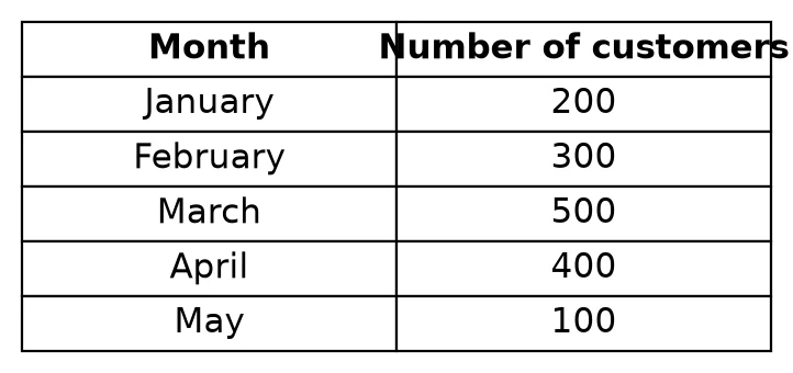
Work it out on paper first. Then mark yourself with the official memo, one tick at a time.
More past paper questions: use bar, pie and line graphs
Work each one out first, then open the memo and check every tick.
3. Question d · Siyavula Grade 8 Mathematics, 19 Represent data, Bar graphs, Worked example 19.1 · 2 marks
The school tuckshop staff kept a record of how many hot dogs, sandwiches, salads and burgers they sold in one day. The bar graph represents the data they collected.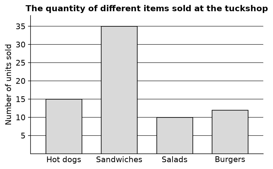 d How many more sandwiches than salads did they sell?(2)
Show the memo (2 ticks)Memo
- ✓Read both valuesReading the values off the vertical axis: sandwiches and salads were sold.
1 mark · Use bar, pie and line graphs
- ✓Difference, so there were more sandwiches sold than salads.
1 mark · Use bar, pie and line graphs
- ✓
4. Question WE4 · Siyavula Grade 11 Mathematics, 11.2 Histograms, Worked example 4 · 5 marks
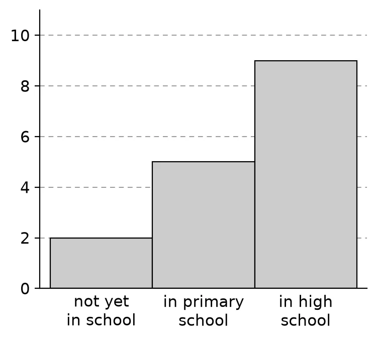 WE4 Use the following histogram to determine the events that were recorded and the relative frequency of each event. Summarise your answer in a table.(5)
Show the memo (5 ticks)Memo
- ✓Events and countsThe events are shown on the -axis: not yet in school, in primary school and in high school.
The height of each rectangle gives the count: not yet in school: ; in primary school: ; in high school: .1 mark · Use bar, pie and line graphs
- ✓Total frequency
1 mark · Read and complete a frequency table
- ✓Relative frequency: not yet in school
1 mark · Use relative frequency
- ✓Relative frequency: in primary school
1 mark · Use relative frequency
- ✓Relative frequency: in high school
Summary: not yet in school: count , relative frequency ; in primary school: count , relative frequency ; in high school: count , relative frequency .1 mark · Use relative frequency
- ✓
Free on Android
Know exactly which skill is costing you marks.
Mark past papers tick by tick in the NavyBlue app. It remembers every mark you lose, shows you the skills to fix first, and picks your next questions.
Get NavyBlue free on Google Play